
Wherever we have lived as a family over the years, my dad’s home office has had three constants. A snow globe of a leprechaun my mum brought back from Ireland, the dog beds of Max, Sam, Charlie, Louie or Remy (depending on the year) and big framed pictures of old Italian film posters on the walls. Now, while these items may not seem particularly interesting, they have always been surrounded by a rotation of obscure books, one-of-a-kind vinyl records and a collection of over 2,000 DVDs (yes, I counted.)
This unofficial shrine to arts and culture made sick days home from school absolutely captivating for my 18 years of an undiagnosed attention disorder. My tendency to hyper fixate on one subject and my devastating inability to learn a second language cumulated into a fascination with foreign cinema. There’s something strangely romantic about having no clue what’s going on in a film (especially if we’re talking Fellini), but feeling what they feel through a combination of paratext and mis-en-scene.
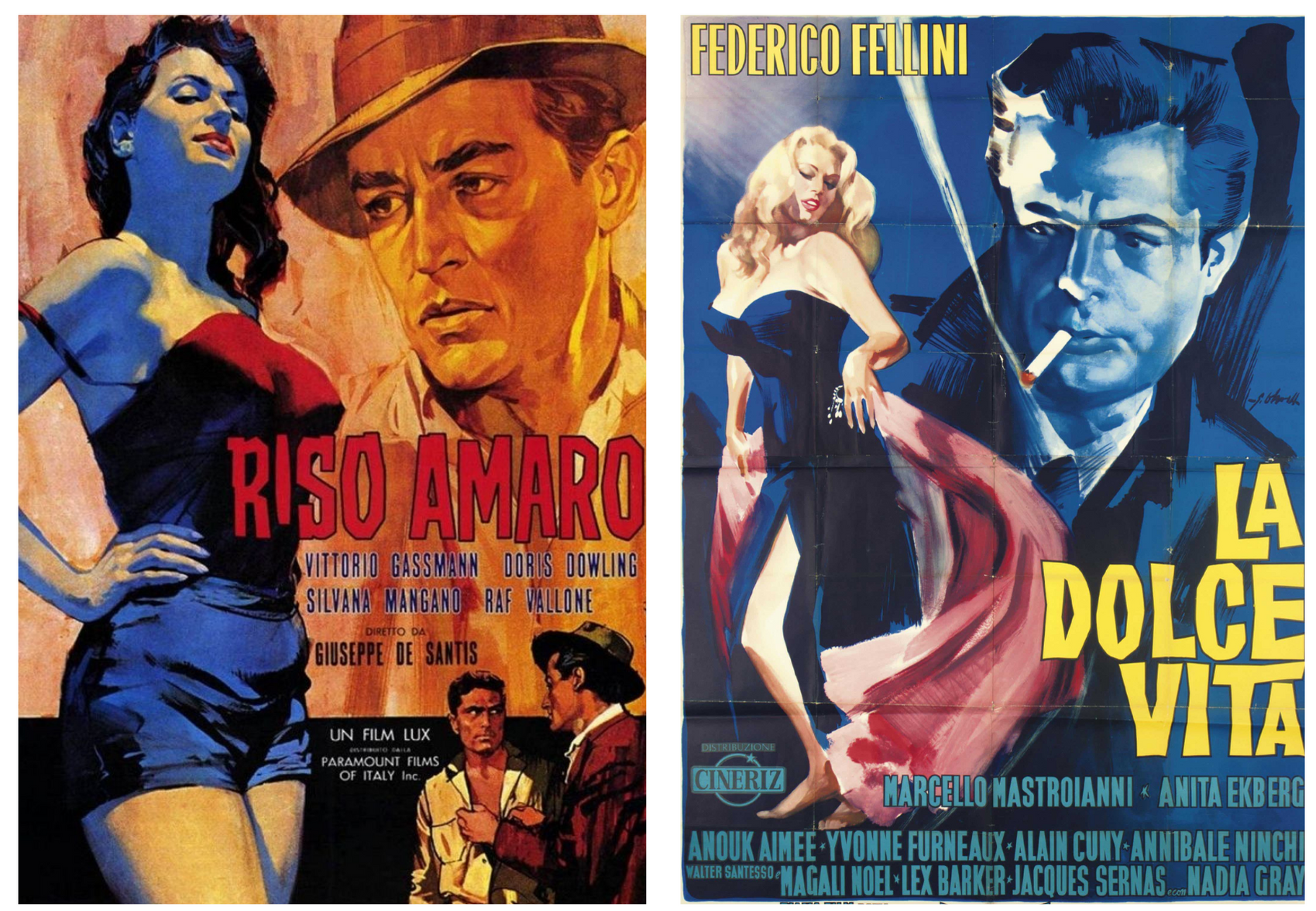
This leads me on to typography, which, back in the 1950s, was make-or-break when it came to drawing in an audience. This was a time when colour film was not yet widely available, not everyone was lucky enough to have a TV in their home, and the Blade Runner-esque billboard screens we see at the bus stop would’ve been doused in so much Holy Water they’d short circuit.
The huge, mass-produced, screen printed posters advertising the latest picture had to be so visually shocking they’d be borderline screaming for the attention of passers’ by. In mid-century Catholic Italy, film posters couldn’t be as sexually suggestive as they can be today, meaning designers had to think up different ways to capture the eyes of the public, including high saturation, risqué composition and the campest typography you’ve ever seen in your life.
The pieces you’ll find in this blog will be looking into the presentation of these titles as it pertains to the context of the film, the intentions of directors, how materials available may have dictated their overall presentation, as well as a sprinkling of theory into the typographic style that makes Italian film posters so iconic. Andiamo!